FACE2GENE MOBILE APP
WHAT is face2gene?
Face2Gene is a suite of phenotyping applications that facilitate comprehensive and precise genetic evaluations.
Through the technology of facial recognition, Face2Gene can detect phenotypes and reveal relevant facial and non facial features. How does this work? Deep learning algorithms build syndrome-specific computational-based classifiers (syndrome gestalts). Proprietary technology converts a patient photo into de-identified mathematical facial descriptors (facial descriptors). The patient’s facial descriptor is compared to syndrome gestalts to quantify similarity (gestalt scores) resulting in a prioritized list of syndromes with similar morphology. Artificial intelligence suggests likely phenotypic traits and genes to assist in feature annotation and syndrome prioritization.
The Opportunity
The Face2Gene mobile app revealed a decline in users uploading photos and cases. Research showed that users uploaded an average of 2 cases before becoming inactive with the app. Our sales and success team reached out to some of our users to find out certain pain points of the mobile app. From our research, it was clear that a total mobile redesign was necessary.
The Goal
The goal of the complete redesign was stop users from losing interest in uploading their cases. I was tasked to redesign every aspect of the app. For now, I wanted to show the redesign of uploading a new case. This was the most obvious pain point for users according to our Success Team.
The Research
There are two primary users of Face2Gene, clinicians and geneticists. Clinicians and geneticists use the Face2Gene app as a diagnostic tool just like a thermometer or a stethoscope. The user snaps a quick photo of the patient and immediately the clinician or the geneticists wants to see results quickly in real time. The app must be work easy, quickly and efficiently. The clinician is evaluating many patients so speed and efficiency is the most important to their workflow. One user was quoted saying that “every time they opened the app it took a couple seconds to analyze what they were seeing on screen and dig where to find add a new case”. “The adding a case button is kind of hidden and lost with all the information present on the first screen”.
Design: Sitemap
Before designing wireframes, the architecture of the facility portal must first be determined. The importance of this is to create a navigational order, labeling system and hierarchy.
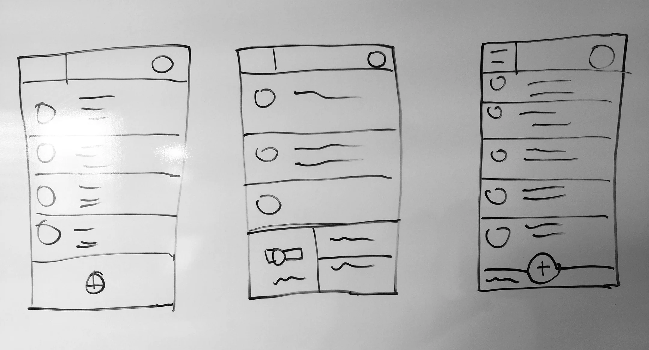
Design: Rough Sketches
In this process, I try to explore different ideas and concepts to create a product that is innovative, user friendly, and most of all achieve the goals of the user.
Design: Before and After Wireframes
A side by side comparison will show the drastic change in design. Add a new case is now located at the bottom. Typically when a user holds their phone the thumbs are the first finger used when tapping on a button. The home button is located at the button. It only makes sense to have the add a new case button on the bottom, close to the thumbs for easy tapping. Originally, the user would have to reposition their hands holding the phone and tap with their index finger making it very awkward and sometimes taking a bit more time. Another advantage is allowing more for information for each case. This information is vital to the clinician and geneticist. Keeping it up from and allow more information to bee seen with more room for clarity is a big plus for users.
Design: Annotated Wireframes for Android
As you can see with the annotated wireframe it is clear why some of these features were decided. Providing such information is also helpful to the developer when time comes to build it out.
Final Design: Interactive Prototype
Link to final InVision mobile prototype:
CLICK HERE


